Quest System UI/UX
My Role: UI/UX Designer · User Flows · Wire-framing · Interaction Design, Multiplayer UX · In-Engine Implementation.
I joined the team at the start of production, and had ownership over driving UX for various features, including the full quest experience. I collaborated closely with Narrative, Game Design, Art and Engineering. The game was a family-friendly ARPG designed for both families and children, with players who could have very different levels of game literacy and experience.
The Quest System needed to connect quest selection, progression, and rewards across solo and multiplayer experiences. I established the UX structure for how players access main and side quests, track their progress and rewards, and navigate quest selection across single-player, local co-op, and online multiplayer, accounting for party leader controls, player readiness, and the procedural RunMaker system.
Design Intent:
- Ensure players are able to navigate all aspects of the Quest System through the necessary UI Screens & Interactions.
- Players are able to view and select Main Quests to initiate a guided fray run.
- Players can choose to scale the difficulty of these quests or stick to default difficulty.
- Narrative and IP Immersion.
- Single Player Experience.
- Online Multiplayer Experience.
- Co-Op 2-4 player experience.
Gameplay Requirements:
- Tracked Quest information is used to inform RunMaker on what to include in its procedural generation of Runs.
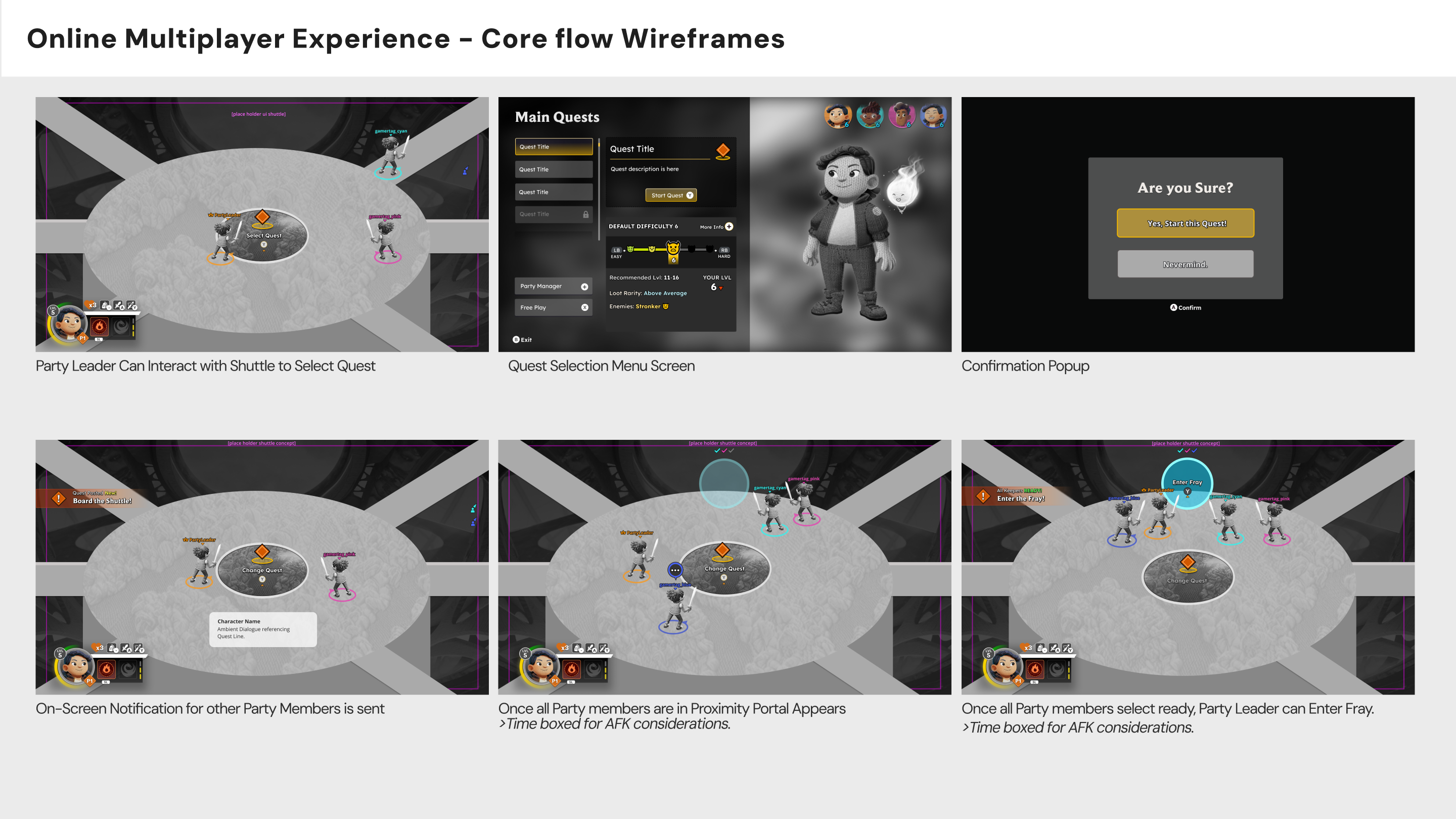
- For Main Quests, this applies to Guided Runs. Main Quests can be accessed through the Shuttle Menu.
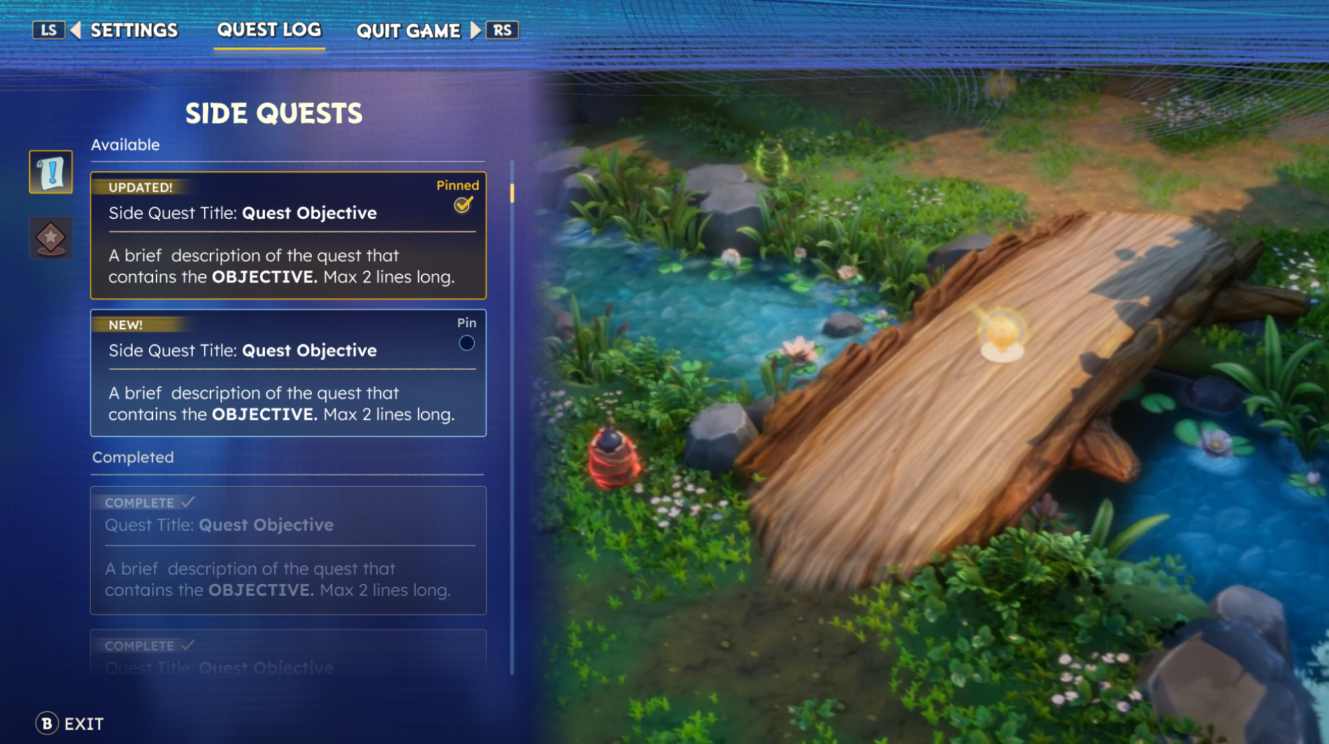
- For Side Quests, this can only be done through the Quest Log in the Pause Menu.
Challenges I solved
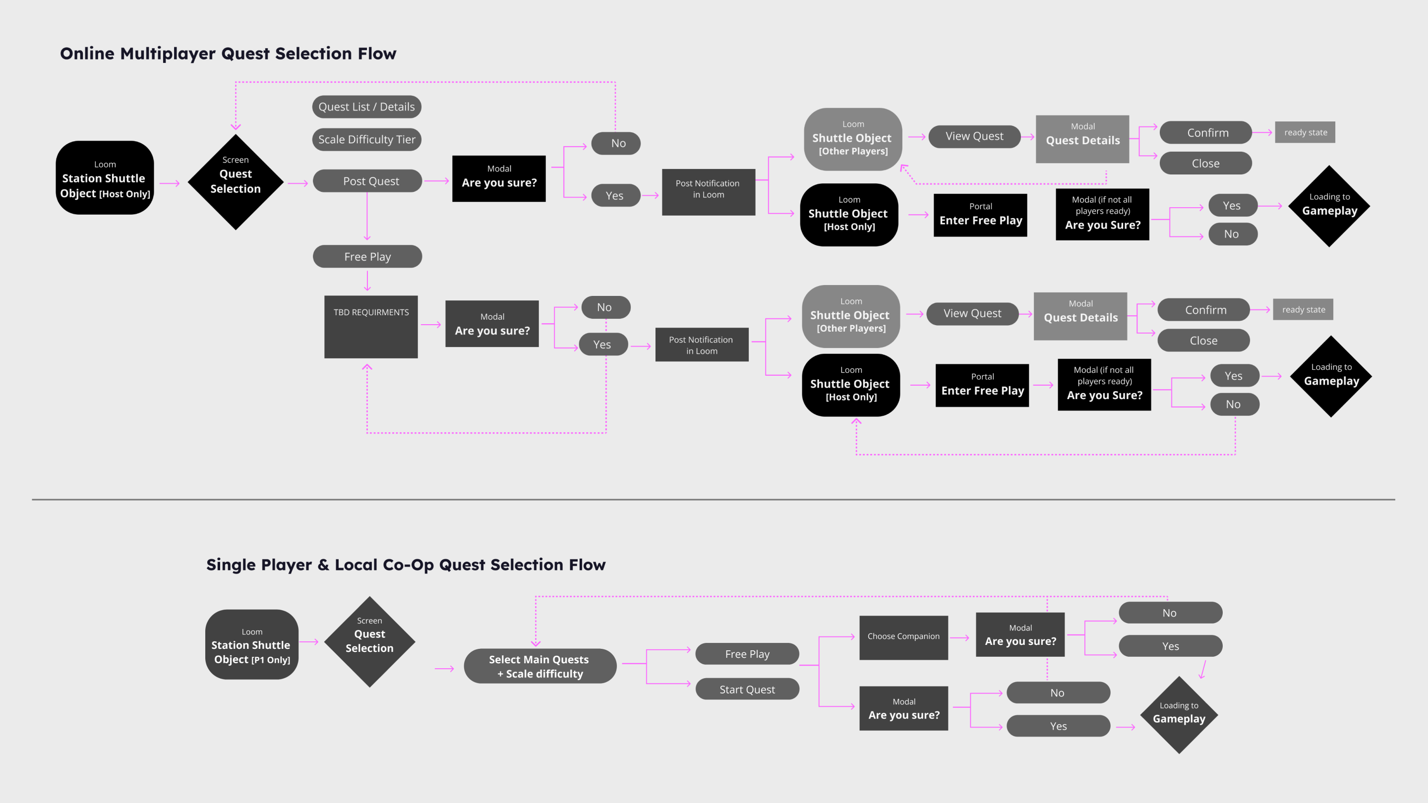
Supporting Different Play Modes - I started by mapping the flows for each mode, focusing on the party leader's responsibilities versus individual players, and on how shared progression should feel.
I utilized User flows as well as competitor analysis for similar games that supported multiple experiences.
Making Quest Navigation Intuitive - I separated the entry points so players always know where to go. Main Quests are accessed through the Shuttle Menu, and Side Quests live in the Quest Log. That meant players didn't have to hunt for what to do next.
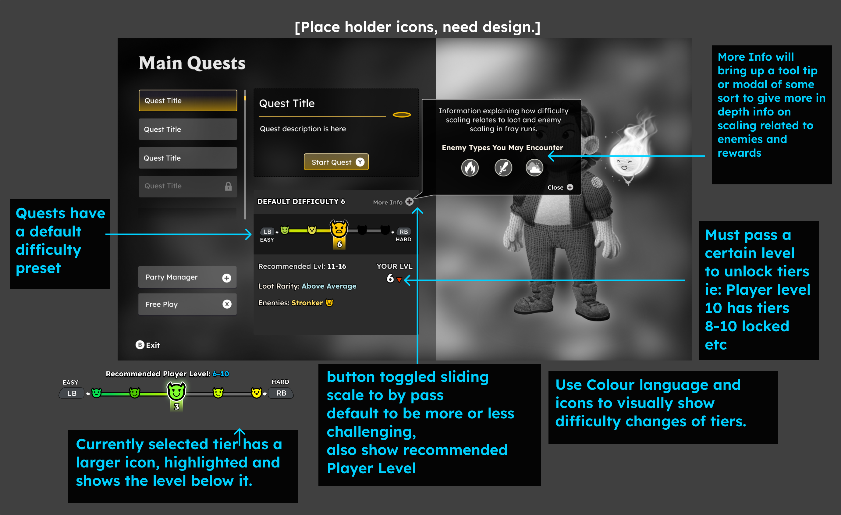
Making Difficulty Easy to Understand - Difficulty affects enemy strength and loot, and higher tiers unlock with player level. That's a lot to communicate. Using progressive disclosure, I gave every quest a smart default for newer players, a bumper-controlled sliding scale to adjust challenge, and a "More Info" tooltip with scaling details for experienced players. Colour and icons together show tier changes, and locked tiers give players something to work toward.
Communicating Quest Progression & Rewards - I used consistent information hierarchy, visual states, and progression cues to help players understand quest status, track objectives, and recognize completion and rewards.
High Level User Flows for Quest Selection
Quest Rewards
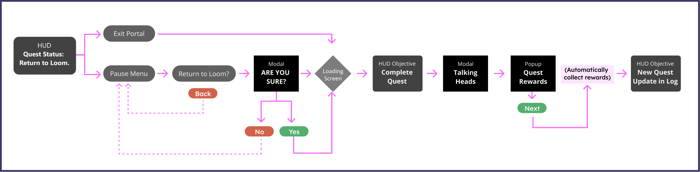
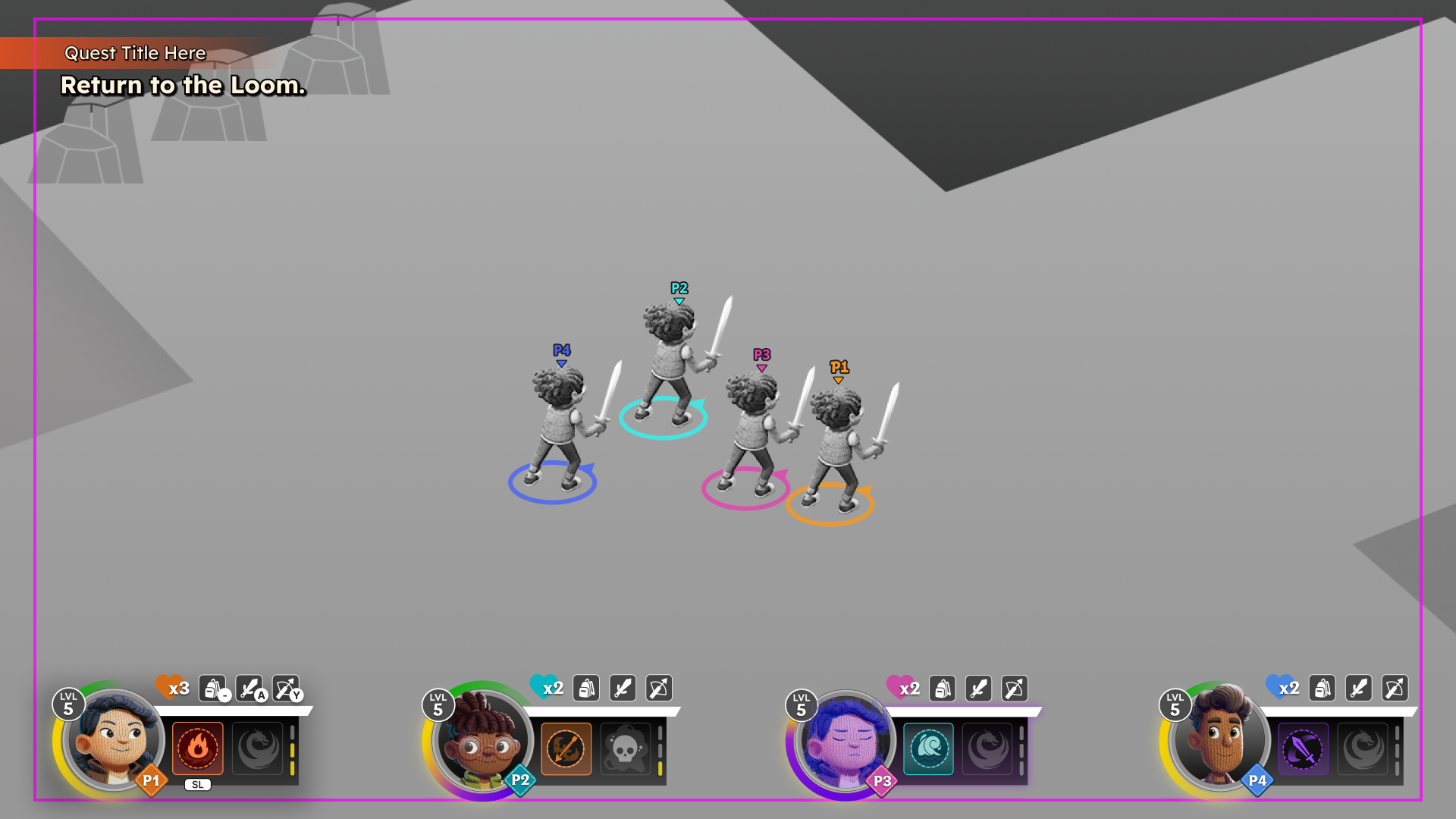
Players complete quest and return to shuttle
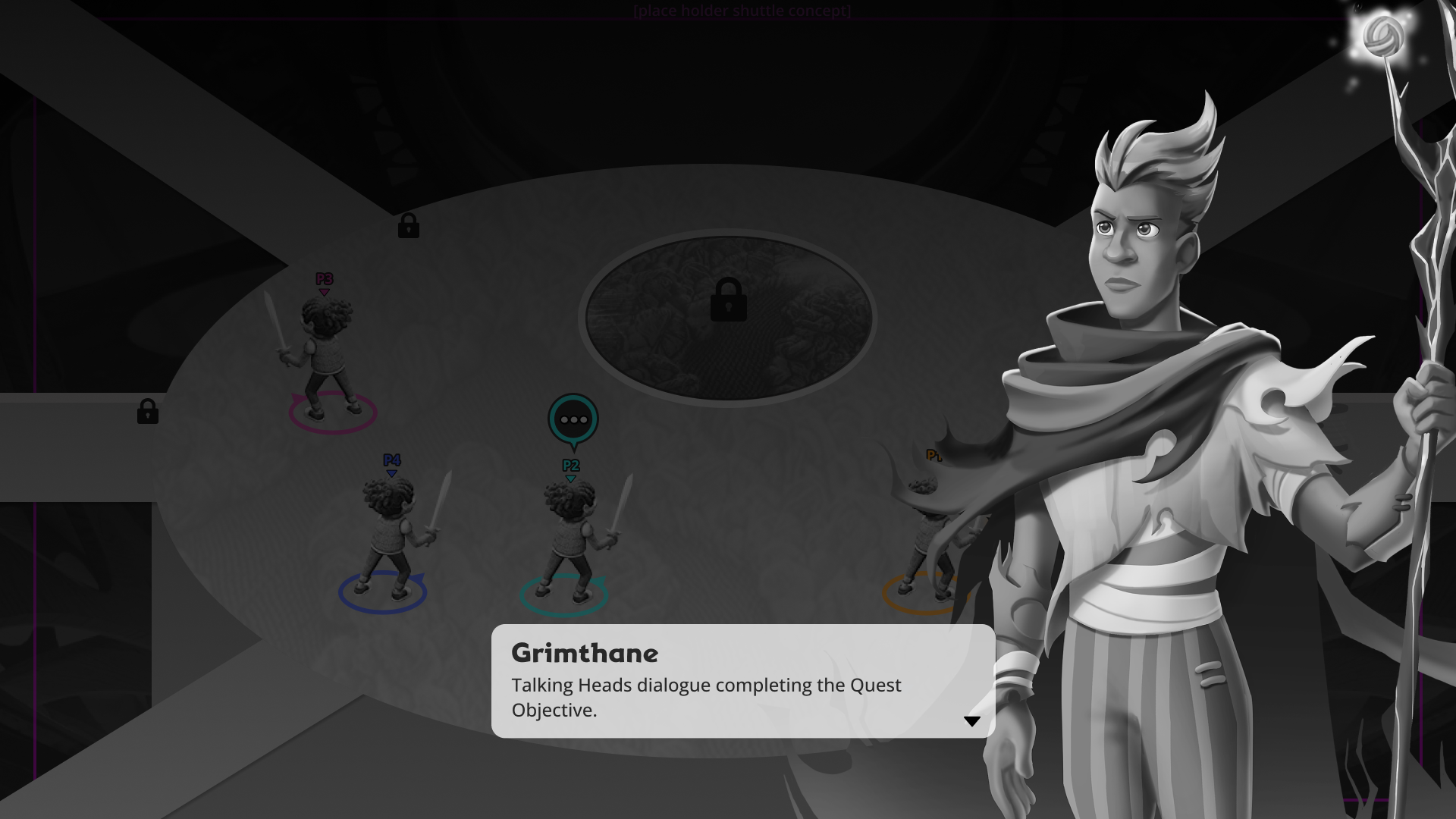
Player 1 hands in the quest
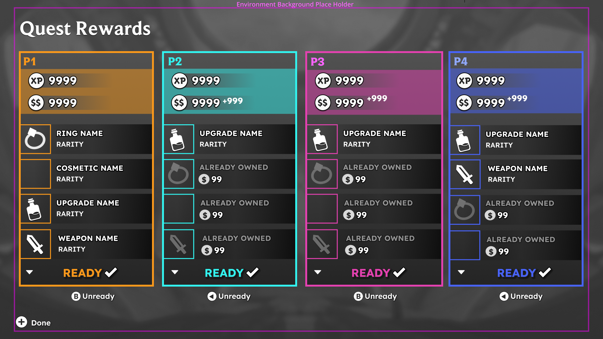
All players see their quest rewards and hit ready
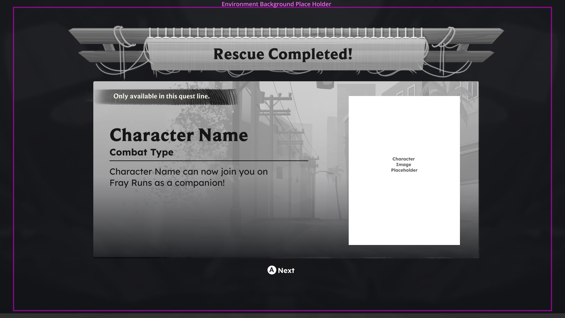
Players are then able to claim individual special rewards
UI Style Application
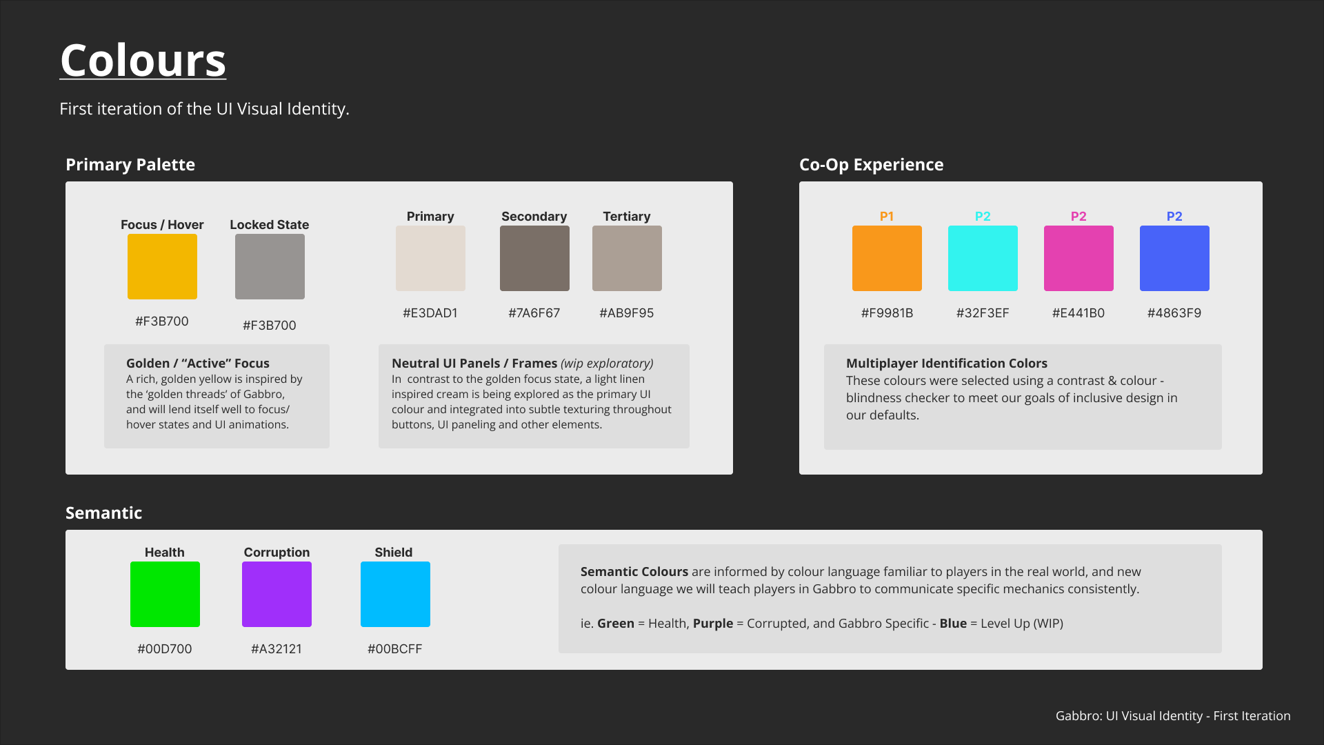
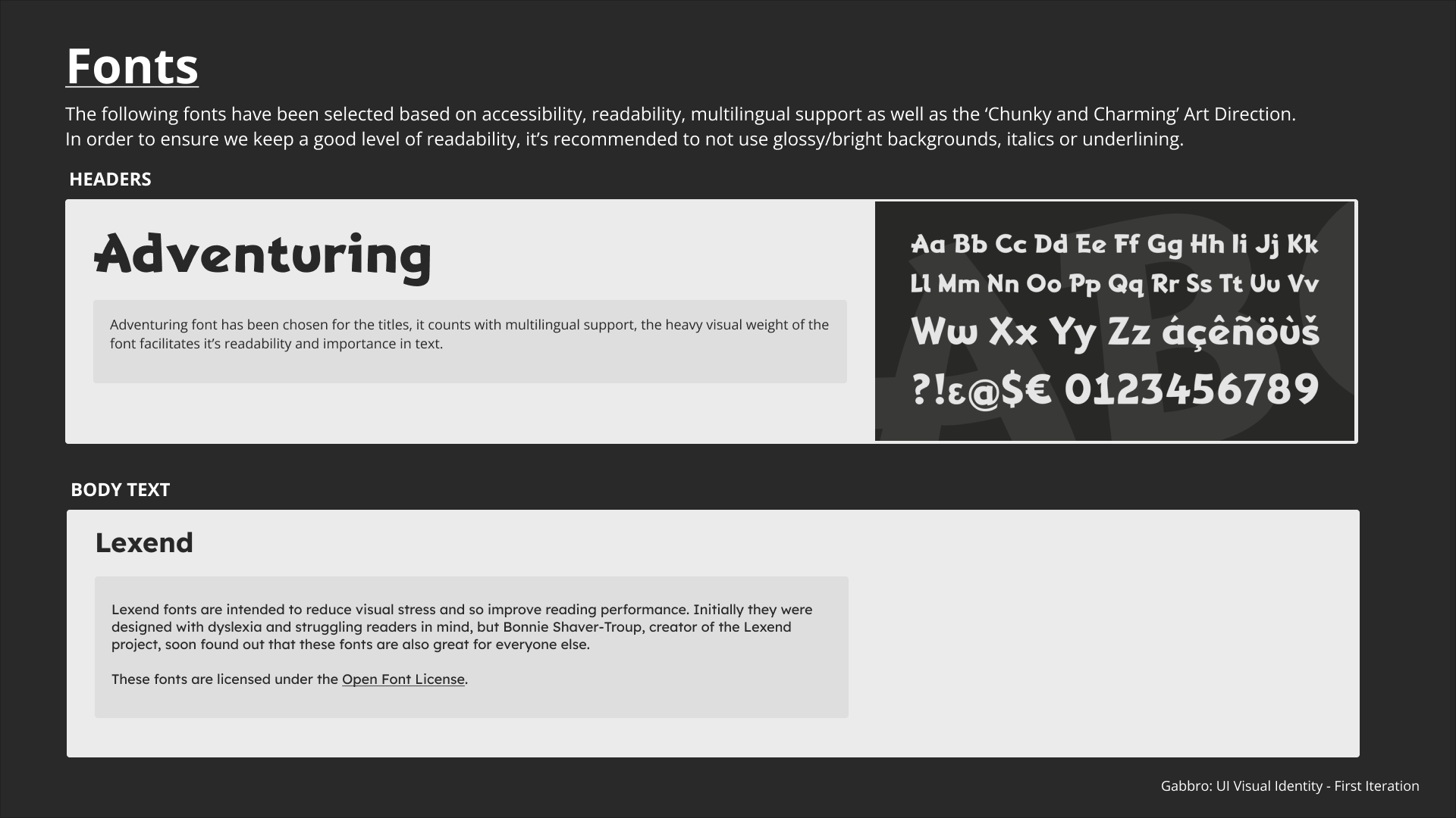
With the UX and layouts established, I led the V1 UI art phase, defining the initial UI style guidelines to align with our UX principles, the IP’s vision, and the visual pillars established by the Art Director.
I collaborated with a team of external UI concept artists to explore different visual directions and develop the foundational UI language. From these explorations, I refined the direction into cohesive UI mockups, establishing how the visual style, hierarchy, and interaction patterns would come together across the Quest System.
My goal was to create an interface that felt distinctly part of the game’s whimsical world without compromising the clarity and usability established through the UX work.
Production was cancelled before the UI and art reached final polish, so the work shown here represents an early V1 iteration with placeholder icons rather than the final shipped experience.
Quest Select Menu - Wireframe
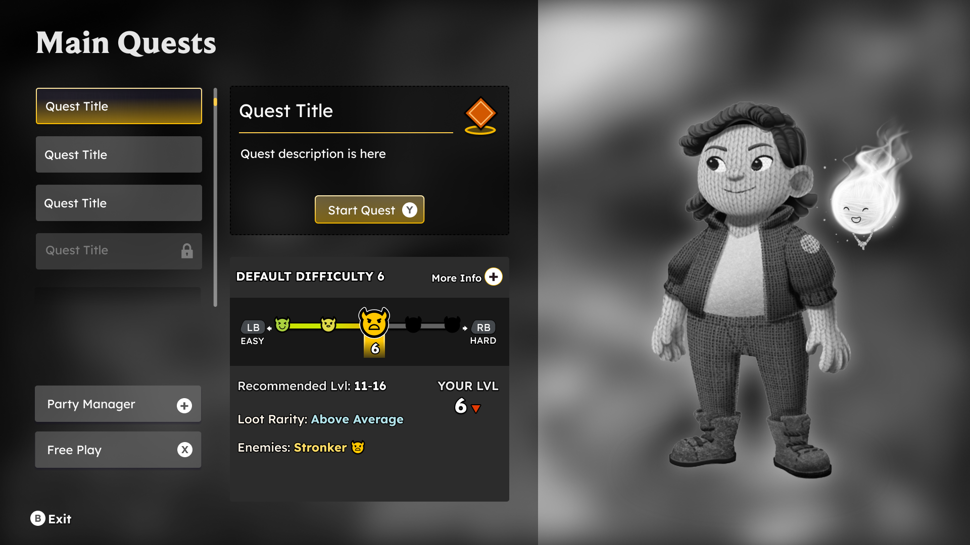
Quest Select Menu - Mockup
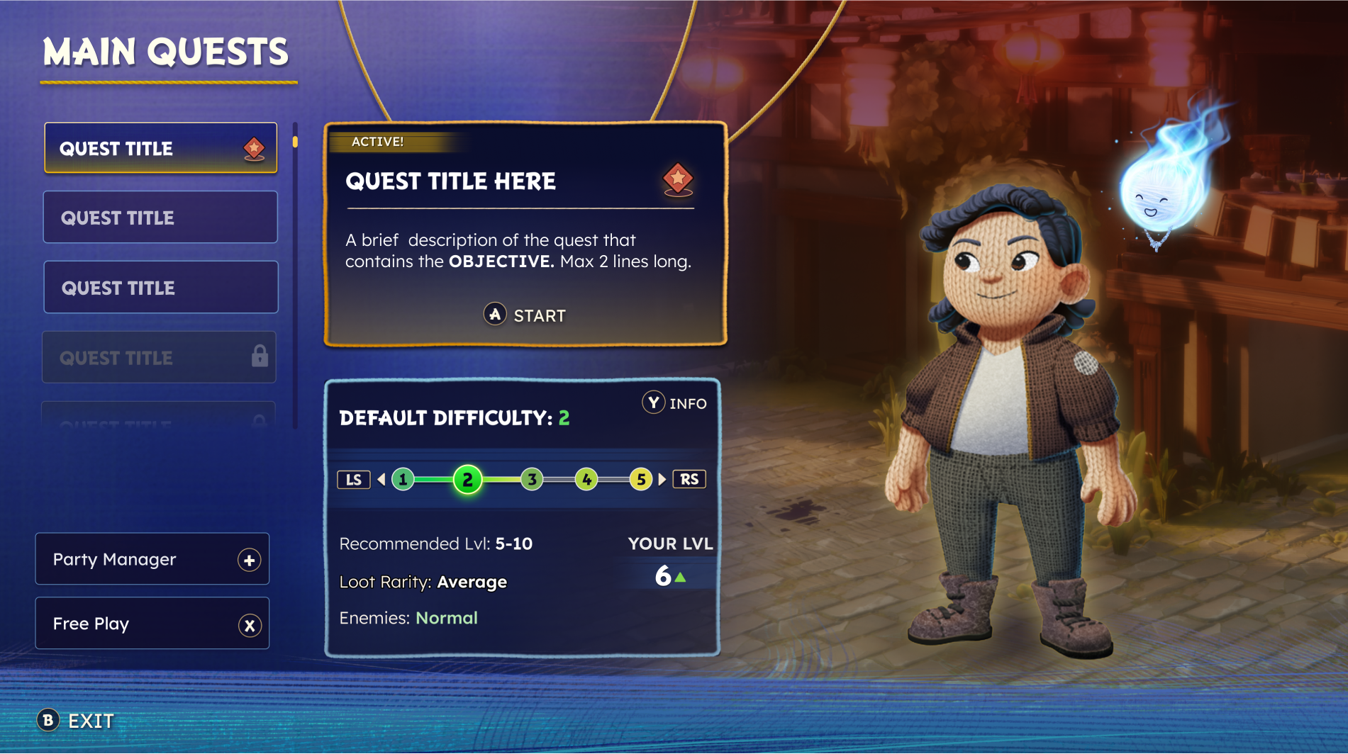
Confirmation Popup - Wireframe
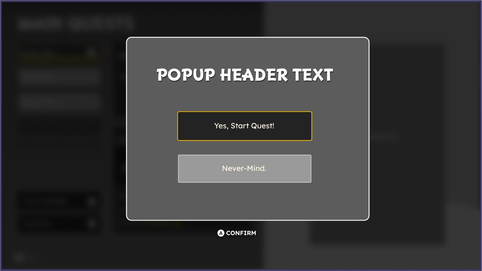
Confirmation Popup - Mockup
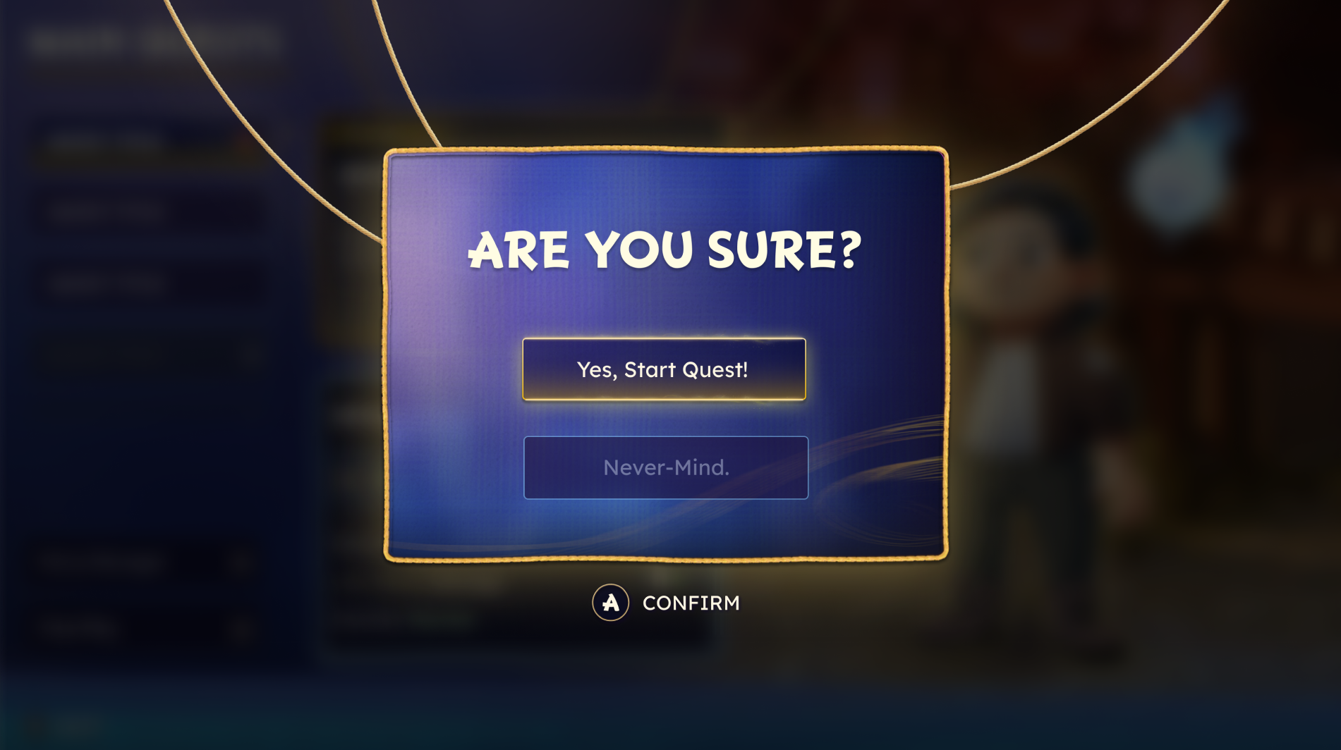
Side Quest Menu - Wireframe
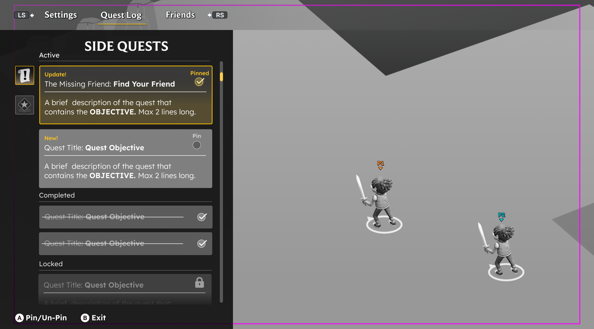
Side Quest Menu - Mockup