Squishmallows Match: Sizing Feature UI/IX

My Role: UX/UI Design · Applying Player Feedback · Wire-framing · Interaction Design · Mockups · Polished UI
Scope: Wire-framing through final polished assets and implementation.
Objective: Improve Player understanding and overall User Experience.
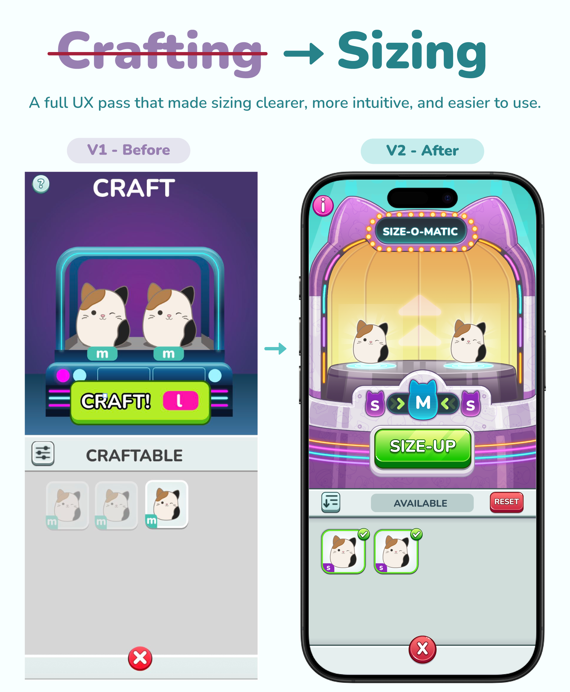
Design Problem
The initial Crafting V1 design established the core mechanic: players combine two duplicate Squishmallows to create the next size while retaining one copy of each size they own. However, the experience still left several opportunities to improve comprehension and player confidence.
- “Crafting” Title didn’t match the functionality of increasing a character’s size and using duplicates.
- The machine needed to feel distinct from the existing Claw Machines used in the core gameplay loop.
- Players had to understand eligibility rules (3 duplicates to size up, keep 1 of each size).
- The New Size presentation needed to be rewarding and exciting.
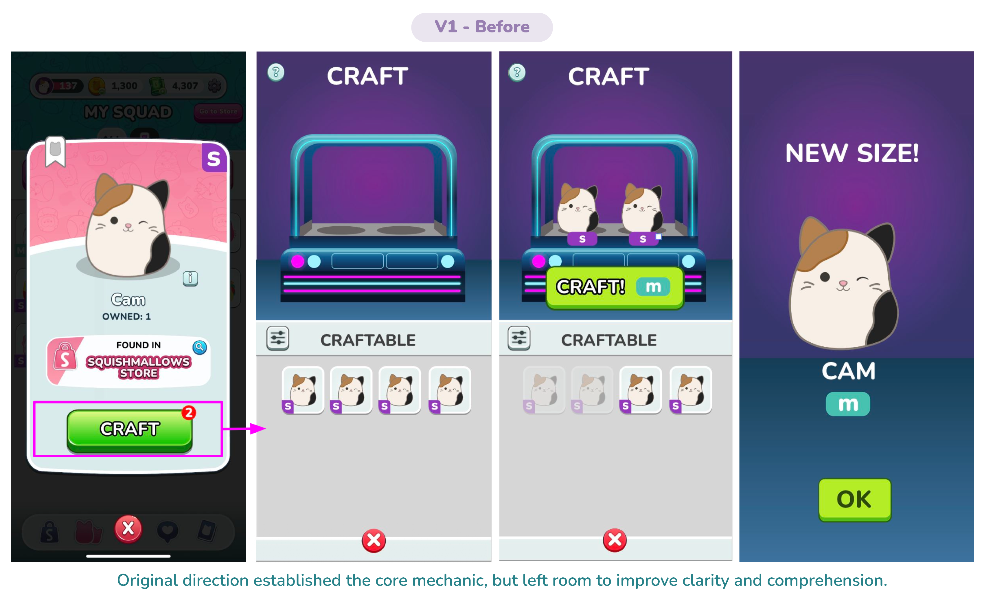
Key Design Decisions
I identified an opportunity to clarify the feature at the product level, starting with its player-facing terminology. I advocated for changing the feature name from Crafting to Size-Up, aligning the language more closely with the actual player action: taking an existing Squishmallow and growing it into a larger size. While a small change on the surface, it helped establish a clearer mental model and made the feature’s purpose immediately understandable.
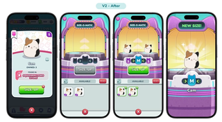
From there, I partnered with the Art Director and relevant stakeholders to define the experience and establish the requirements for the Sizing Machine. I then translated those requirements into a UI direction focused on communicating the process, inputs, and outcome at a glance:
- Two input slots showing the required sizes
- A central output showing the resulting size
- A large SIZE-UP button that only becomes active when the requirements are met
- Directional arrows and animation to reinforce the process
- Filter, Reset, and Info controls
I also tied the different button states and machine feedback to the player's inventory. This meant the UI could communicate what was possible and what was needed without relying on a lot of explanatory text.
Size-O-Matic UI documentation
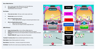
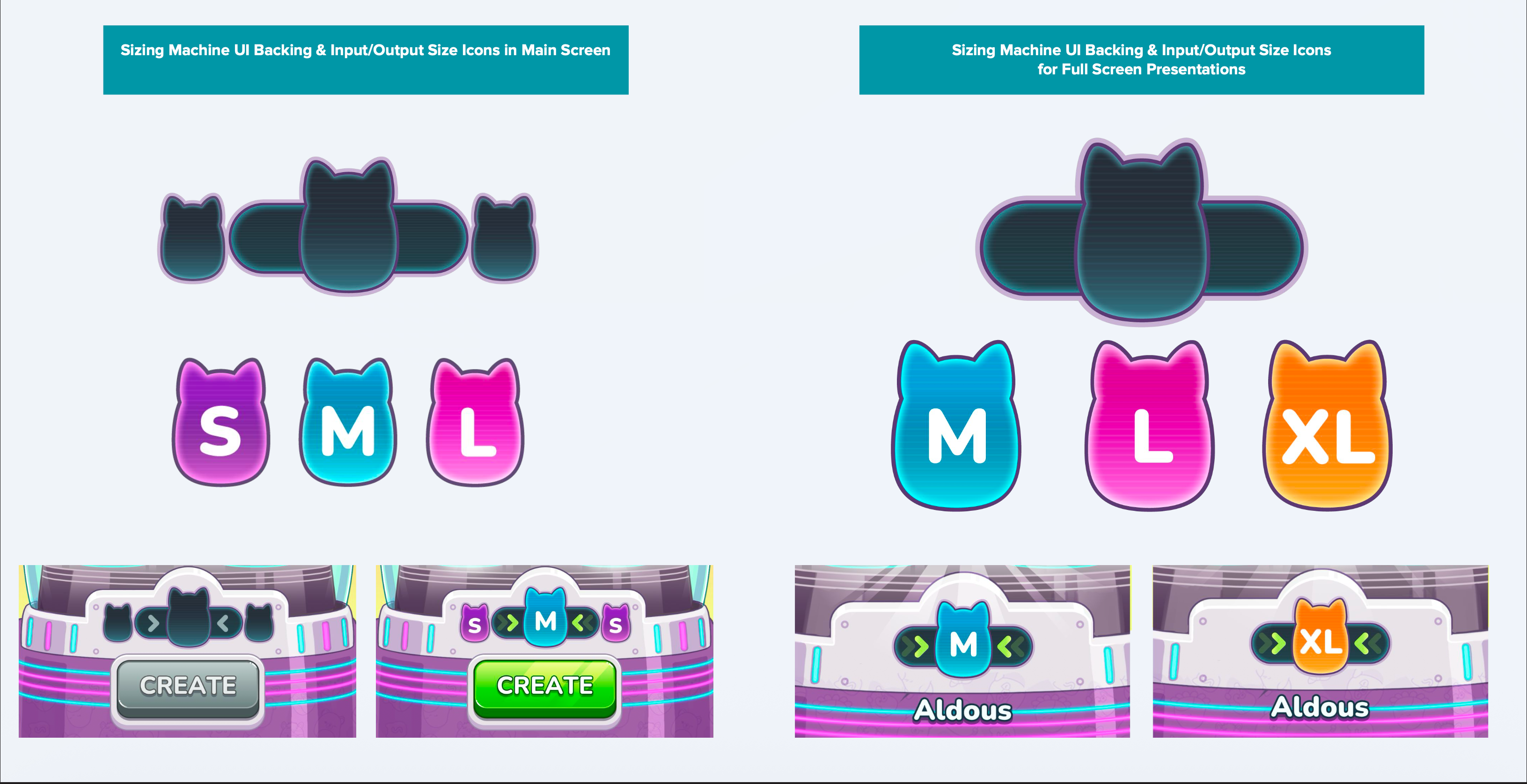
One of the biggest gaps between V1 and V2 wasn't a single screen — it was the lack of a system behind the screens. Sizing icons and feedback moments in the original spec were built ad hoc, and reused from unrelated features where nothing better existed yet.
For the redesign, I built a proper icon and asset system with distinct treatments for every context a size needed to appear in: compact icons inside the machine itself, larger celebratory icons for full-screen reveals, corner badges for squad and inventory cards, and dedicated badges for popup contexts.
New vs. duplicate feedback
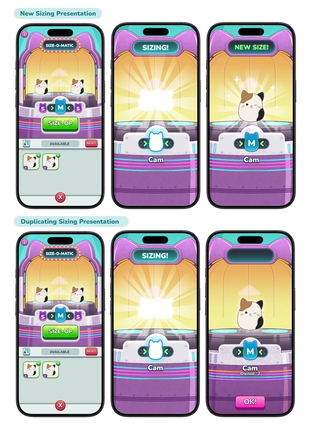
V1 did not have a defined approach for how new and duplicate sizes should be presented to the player, so I took ownership of establishing the experience. I worked cross-functionally with the Art Director and Animation Lead to define a clear presentation strategy that differentiated the two outcomes while keeping them within the same overall experience.
The resulting flows use the same core animation language, but scales the level of celebration based on the significance of the outcome. Creating a size for the first time triggers a more celebratory presentation, with sparkle and ray effects and a “NEW SIZE!” title card. Creating a size the player already owns uses the same core feedback without the additional flourish. This created a more intentional feedback hierarchy, ensuring the UI communicates both what happened and how meaningful the result is.
Outcome & Final Thoughts
The redesign established a clearer foundation by:
- Aligning the name with the actual player action
- Giving the system a distinctive visual identity
- Making the input/output relationship visible
- Turning inventory rules into UI behaviour
- Creating a reusable framework for future size tiers and cosmetic progression
Final Thoughts: This system could extend into cosmetic upgrades or collection milestones using the same Size-o-Matic language to keep the experience cohesive.