Squishmallows Match: UI System

My role: UI/UX Design · UI Art · Design Systems · Implementation Support
Scope: Ownership of UI/UX development from UI style System through implementation and LiveOps support as well as UX for the game.
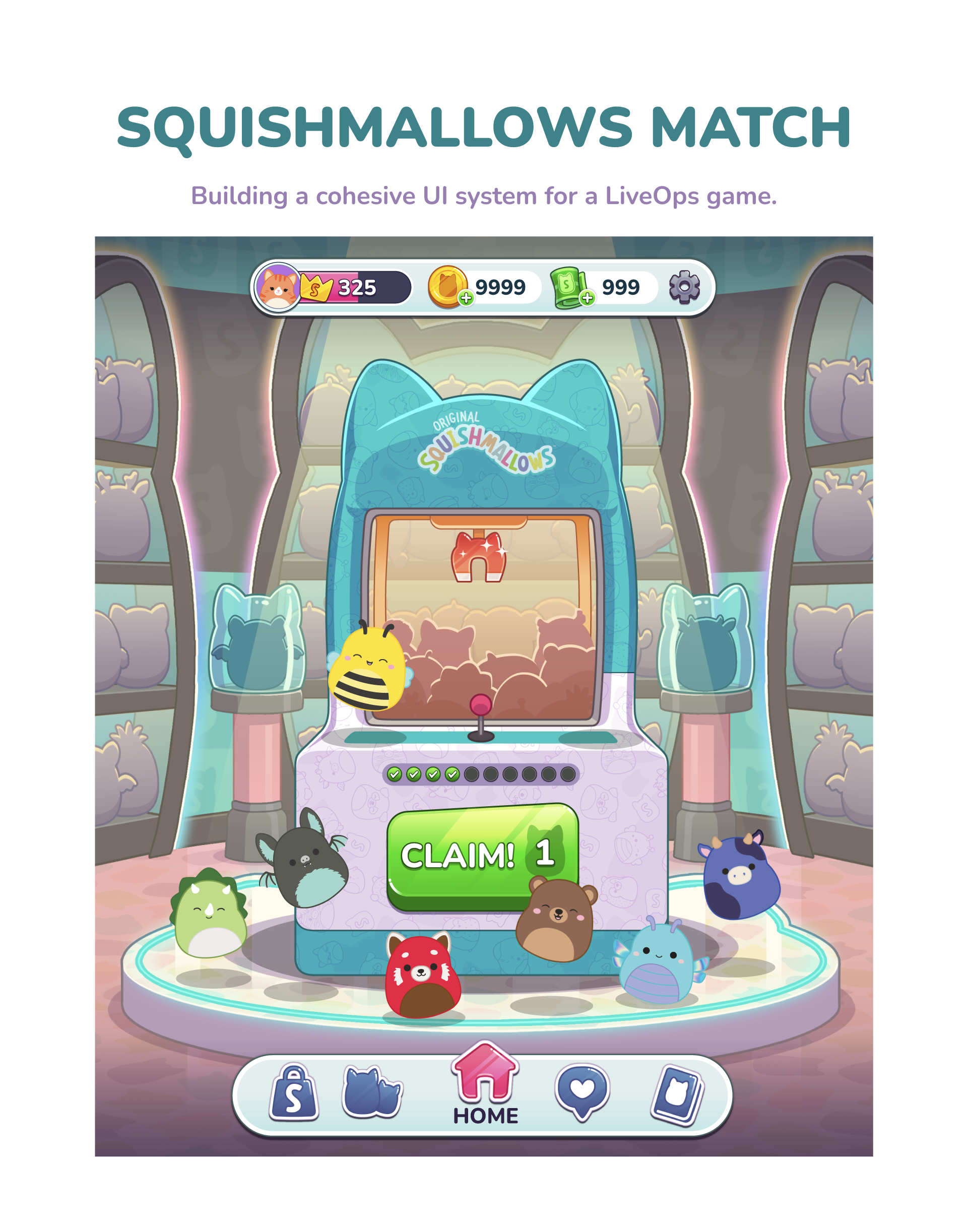
When I joined Squishmallows Match, the project had early wireframes and UI framework explorations in place, but there was not yet a cohesive visual language connecting the game’s match gameplay, collection systems, branded Squishmallows content, and LiveOps features.
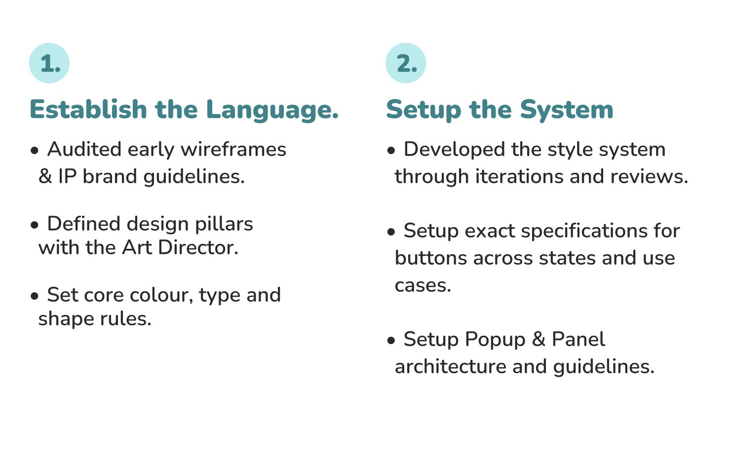
I took ownership of establishing the UI direction and turning that direction into a scalable system that could support the game as it expanded. Working closely with the Art Director and cross-functional partners, I aligned the interface with the creative vision and Squishmallows brand while establishing clear standards for hierarchy, readability, accessibility, and player feedback. I then guided that direction through implementation, helping ensure the experience remained cohesive across the game rather than treating each feature as a standalone UI problem.
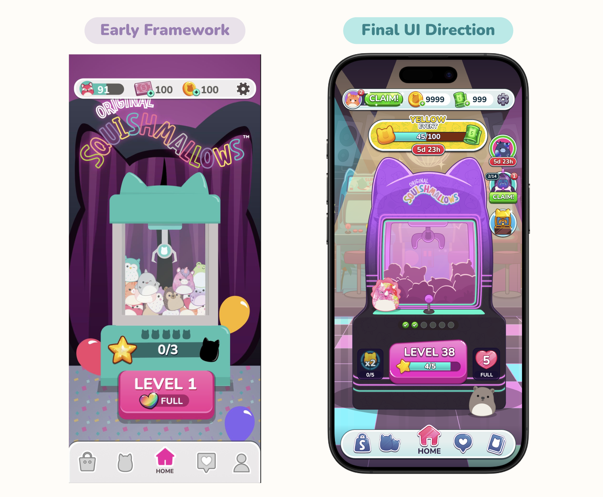
The initial framework provided a foundation that stakeholders were aligned on, but it had not yet accounted for production requirements such as UI safe zones, visual hierarchy, or a defined visual language.
I took ownership of developing that foundation into a cohesive and production-ready UI system. Using the Home Screen as a benchmark, I established the visual language, brand alignment, and production rules that would guide the interface across the rest of the game. This created a shared reference point for both design and implementation, giving the team a consistent standard to build from as new features were introduced.
Key Design Decisions
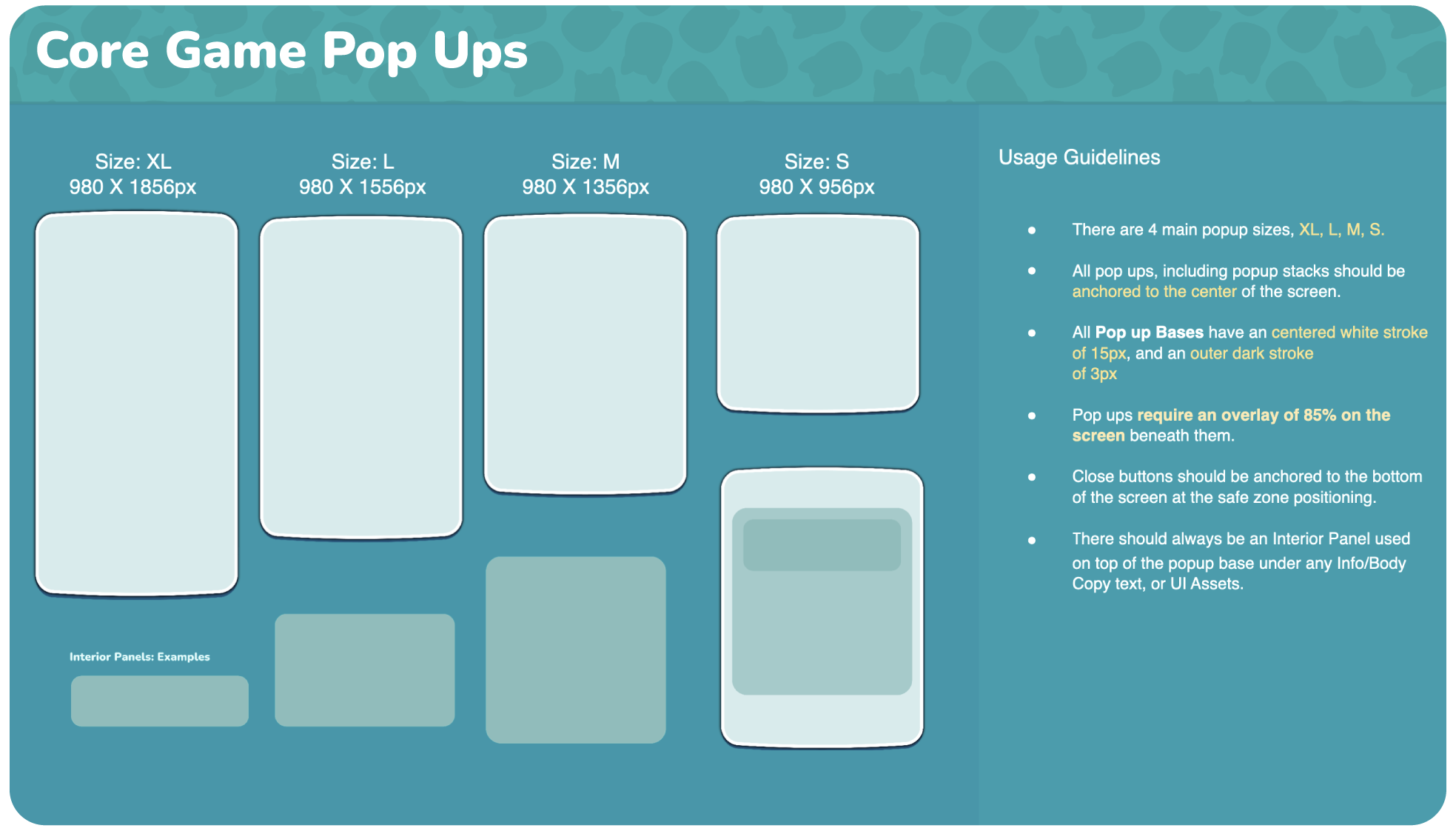
Component-based popup architecture
- Broke every popup into Frame / Top / Separator / Interior Panel / Base instead of designing each one individually.
- New popups — and reskinned seasonal ones — could be assembled from existing parts rather than custom-built each time.
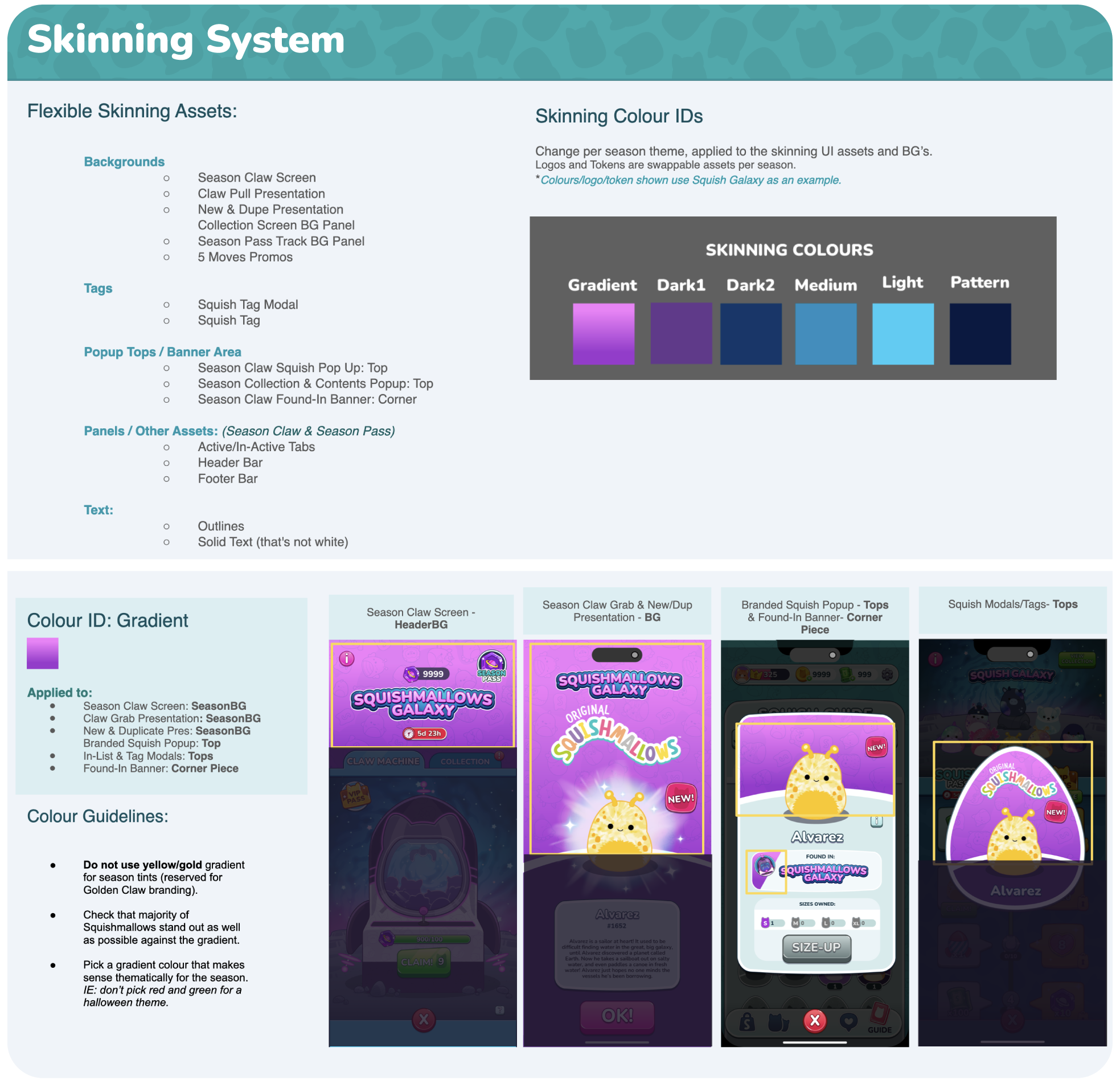
Flexible skinning system
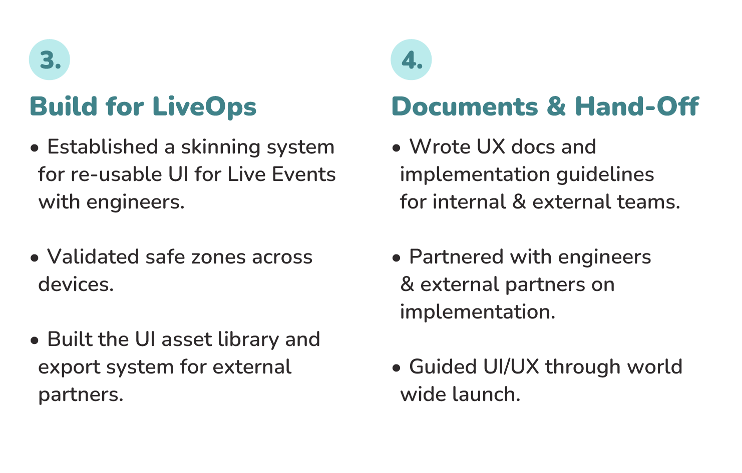
- Defined six colour roles — Gradient, Dark 1, Dark 2, Medium, Light, Pattern to create a flexible ui system for season content. Built from the same assets with new colours applied per season.
- Setup data sheets with the skinning systems hex codes and swappable component information for engineering.
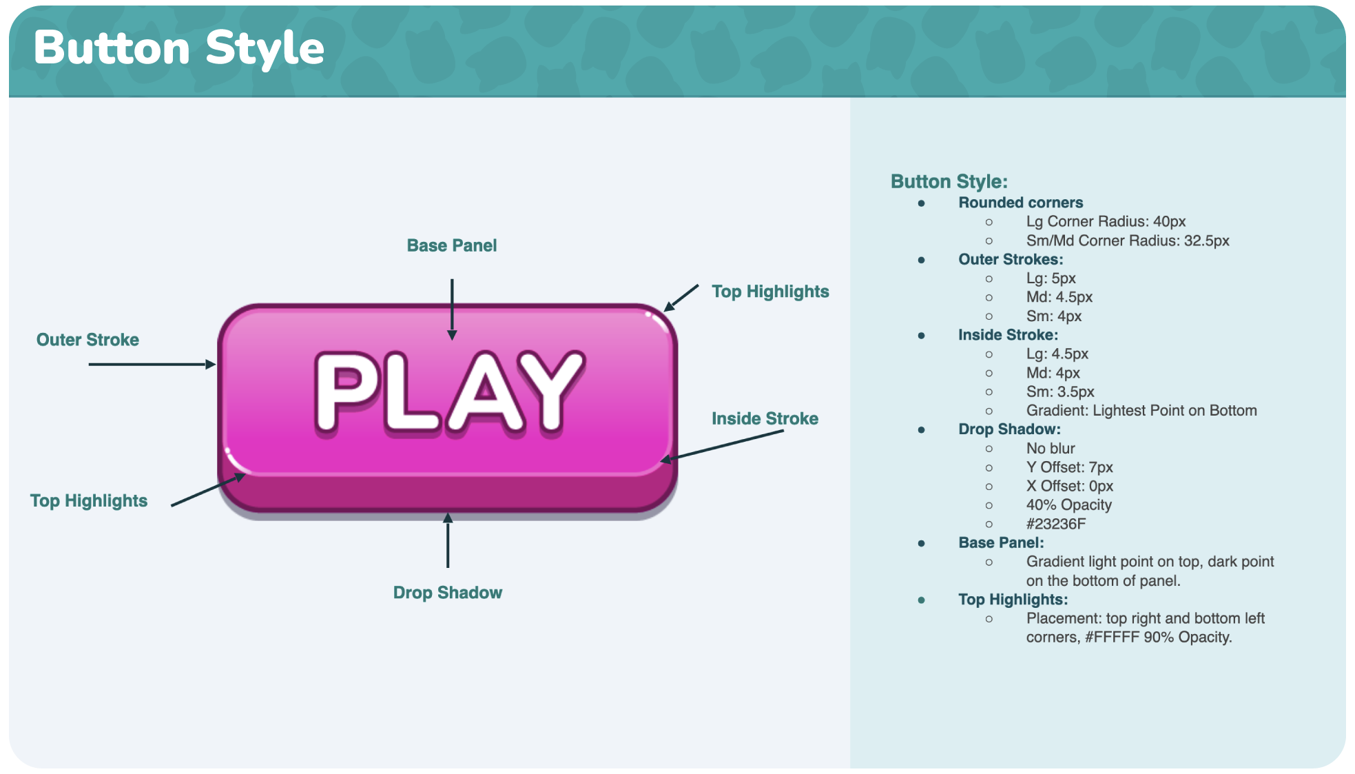
Detailed guidelines for partners.
- Developed style guides intended to allow other designers and engineers to know exactly how to re-create and implement our ui system and brand use guides.
- Gave engineers and the external partners nothing to interpret — implementation matched mocks exactly.
Key ui elements could be reskinned across seasons — including backgrounds, popup tops, tags, panels, tabs, headers, text and colour treatments — while core UI remained recognizable.
This allowed LiveOps content to feel visually fresh while maintaining consistency and usability.
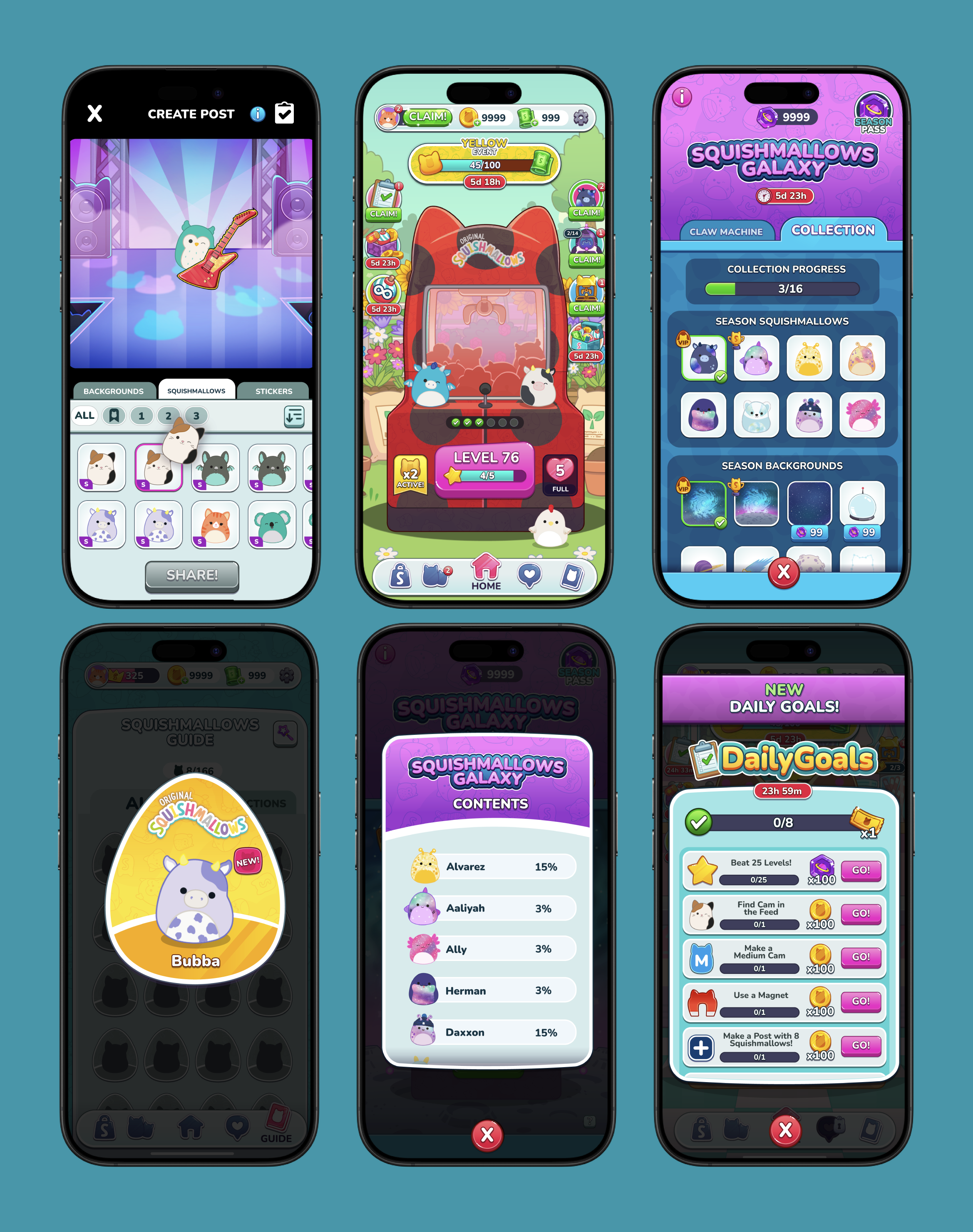
Results:
Stronger player experiences
Feature flows, hierarchy and interactions were developed alongside the visual design.
A cohesive UI language
A visual system aligned with both the game and Squishmallows brand.
Reusable design patterns
Components and guidelines supported new features and content.
LiveOps flexibility
The system could evolve visually without disrupting the underlying experience.
Production-ready handoff
UX specifications, assets and implementation rules connected design intent to development.
Most importantly, the project allowed me to work across the full UI/UX process — from figuring out how an experience should work to defining how it should look and making sure it made it into the game as intended.