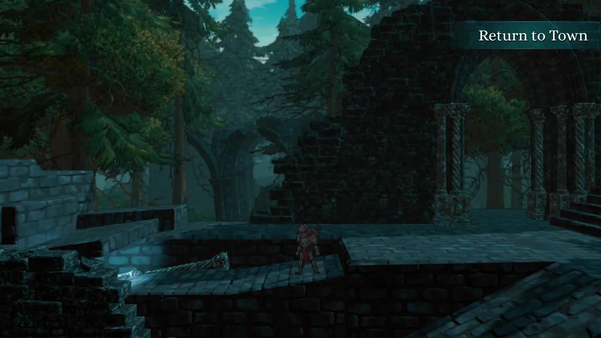
Rhythm in You

Role: UI/UX Designer
I joined the Resonance team to help address UX challenges around gameplay tutorials and on-screen UI inputs in their rhythm RPG. I performed a heuristic review and reviewed player feedback and gameplay to identify friction points, then developed improvements to the tutorial experience and overall HUD to make interactions clearer and more intuitive. I also completed a pass on the UI style system, helping establish a more cohesive visual language across the game’s interface.
HUD & Gameplay UI Heuristic Review
01 — Visual Hierarchy & Player Focus
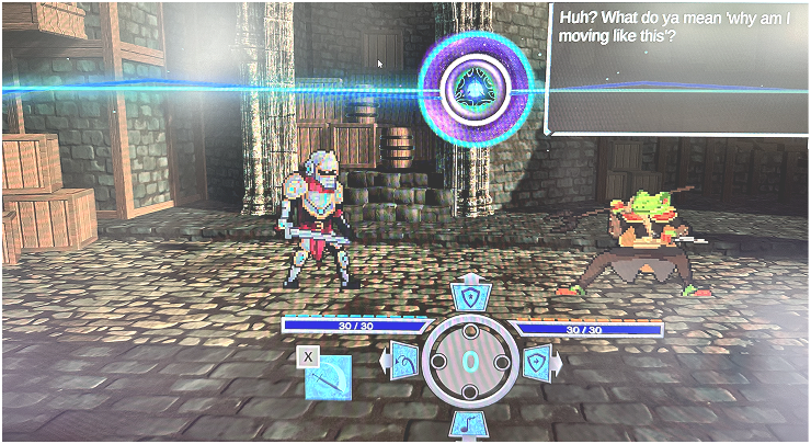
Finding: The current placement of the health bars, streak, and controls creates unnecessary visual competition with the central gameplay area.
Why it matters: Players need to keep their attention primarily on the centre of the screen to accurately time their attacks. Frequently shifting focus to the bottom of the screen makes it harder to monitor gameplay while also tracking important player information.
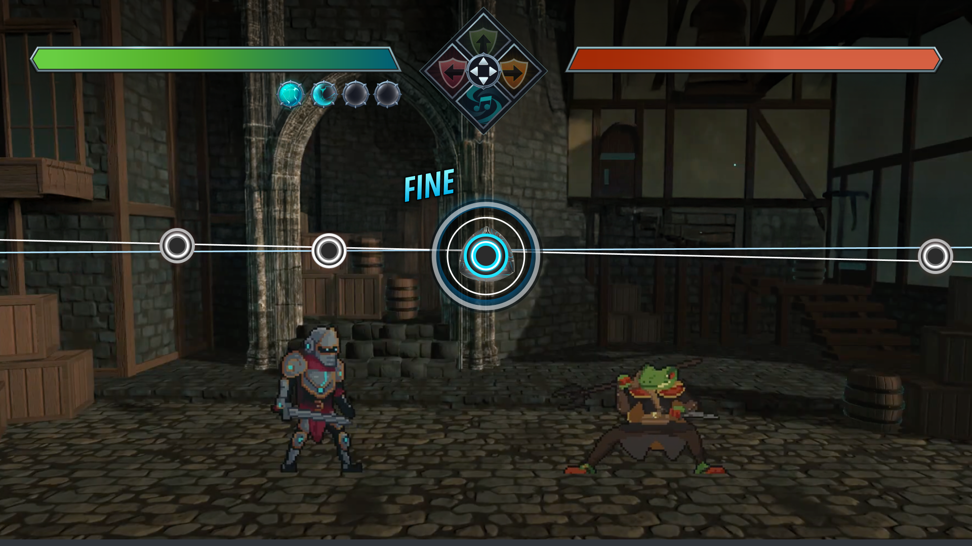
Recommendation: Move the health bars and streak above the controls and toward the top of the screen. This creates better visual balance and allows players to reference this information with less disruption to their gameplay focus.
02 — Reduce Unnecessary Focus on Controls
Finding: Controls currently occupy a relatively prominent position in the HUD despite being information players are likely to learn quickly.
Why it matters: Once players understand the controls, they shouldn't need to regularly shift their attention toward them. Giving the controls less visual weight allows more important gameplay information to take priority.
Recommendation: Reduce the visual emphasis of the controls and arrange them in a horizontal layout. This also creates a more flexible system that can accommodate additional controls or attacks if needed later.
03 — Intentional Colour & Shape Language
Finding: Using more intentional colour and shape relationships can help players quickly identify and parse gameplay information.
Why it matters: Players need to process information quickly while focusing on the beat track and timing their attacks. Consistent visual cues can reduce the amount of time players need to spend interpreting the UI.
Recommendation: Use consistent colour and shape language throughout the HUD. For example, match the colour of control icons to their corresponding inputs on the beat track, creating an immediate visual connection between the input and the required action.
04 — Clear Player & Enemy Feedback
Finding: Player and enemy health information could be made more immediately identifiable.
Why it matters: Clearly distinguishing player and enemy information allows players to quickly understand the current state of the encounter without needing to stop and interpret the HUD.
Recommendation: Consider incorporating Player/Enemy CTAs or identifiers directly into the health bars. This is optional, but could provide additional clarity at a glance.
Original HUD & UI
Revised HUD Wireframe
User Experience: Tutorials
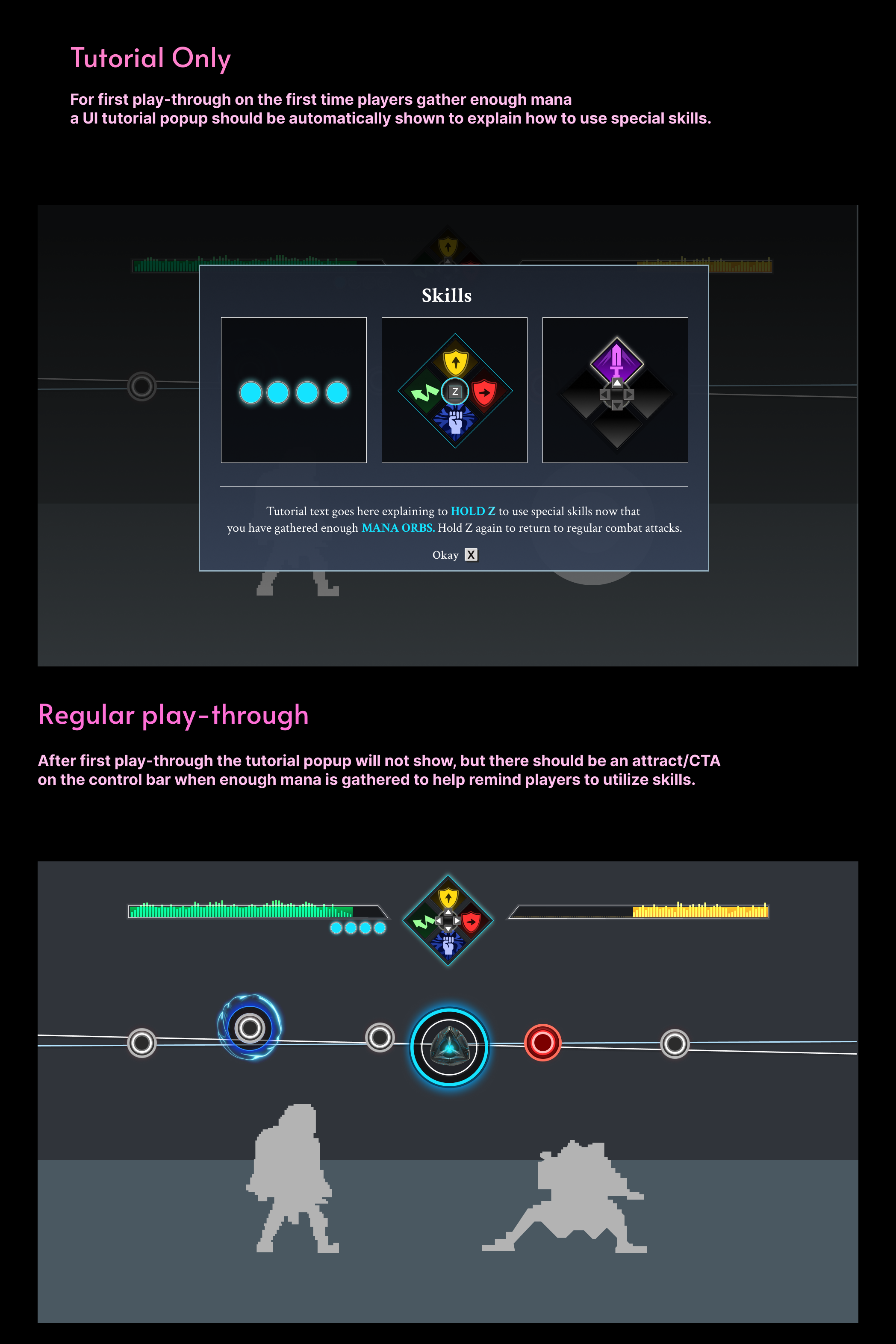
I focused on making tutorials and on-screen prompts clear, contextual, and easy to act on without overwhelming the player.
Design Overview
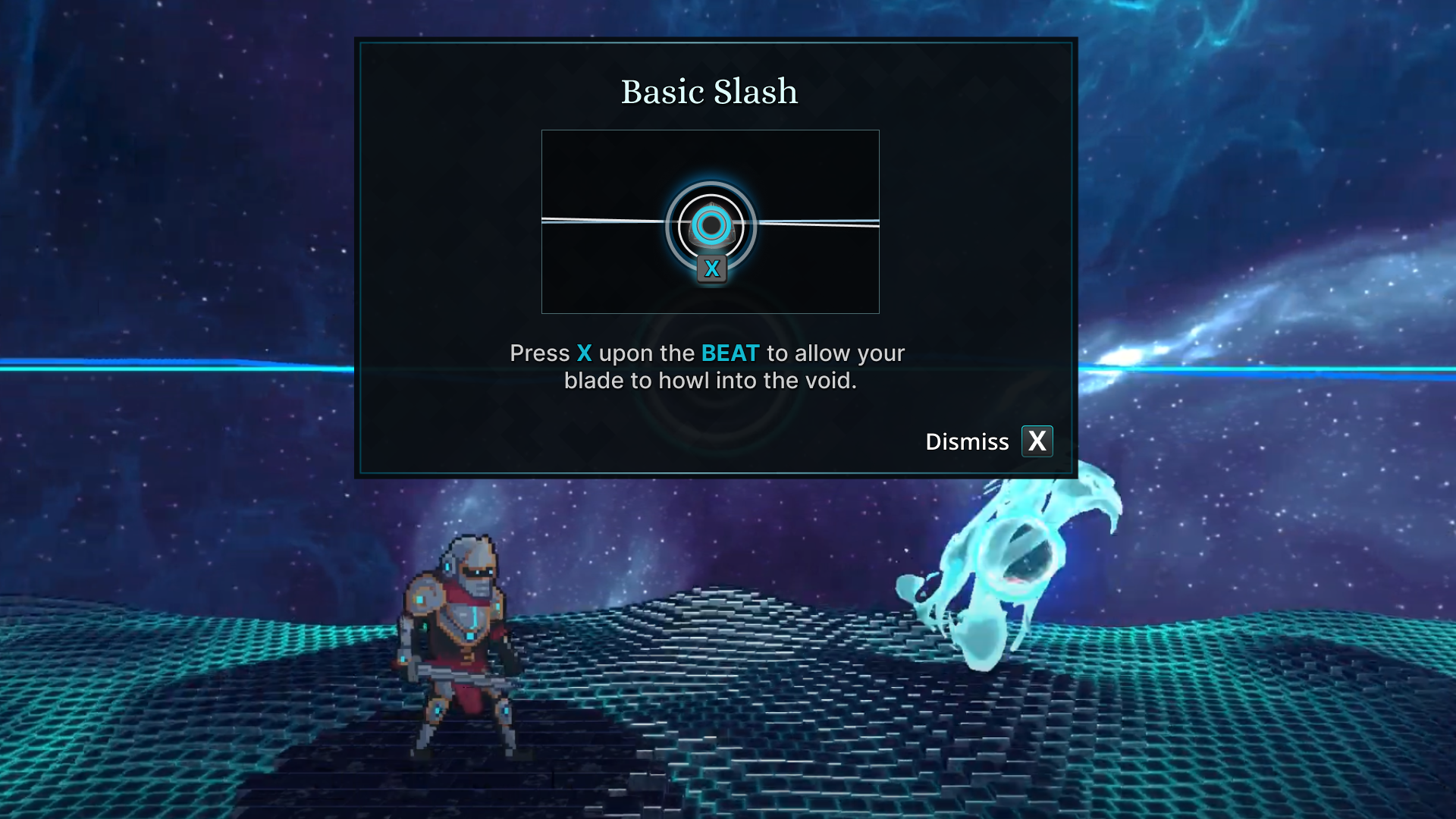
- Improve readability through colour and font-weight changes to help players quickly parse tutorial information.
- Keep tutorials dismissible, while allowing new control prompts to remain visible long enough for players to learn unfamiliar inputs.
- Teach timing through context by introducing combat prompts shortly before the optimal input window and keeping them visible until the action is successfully performed.
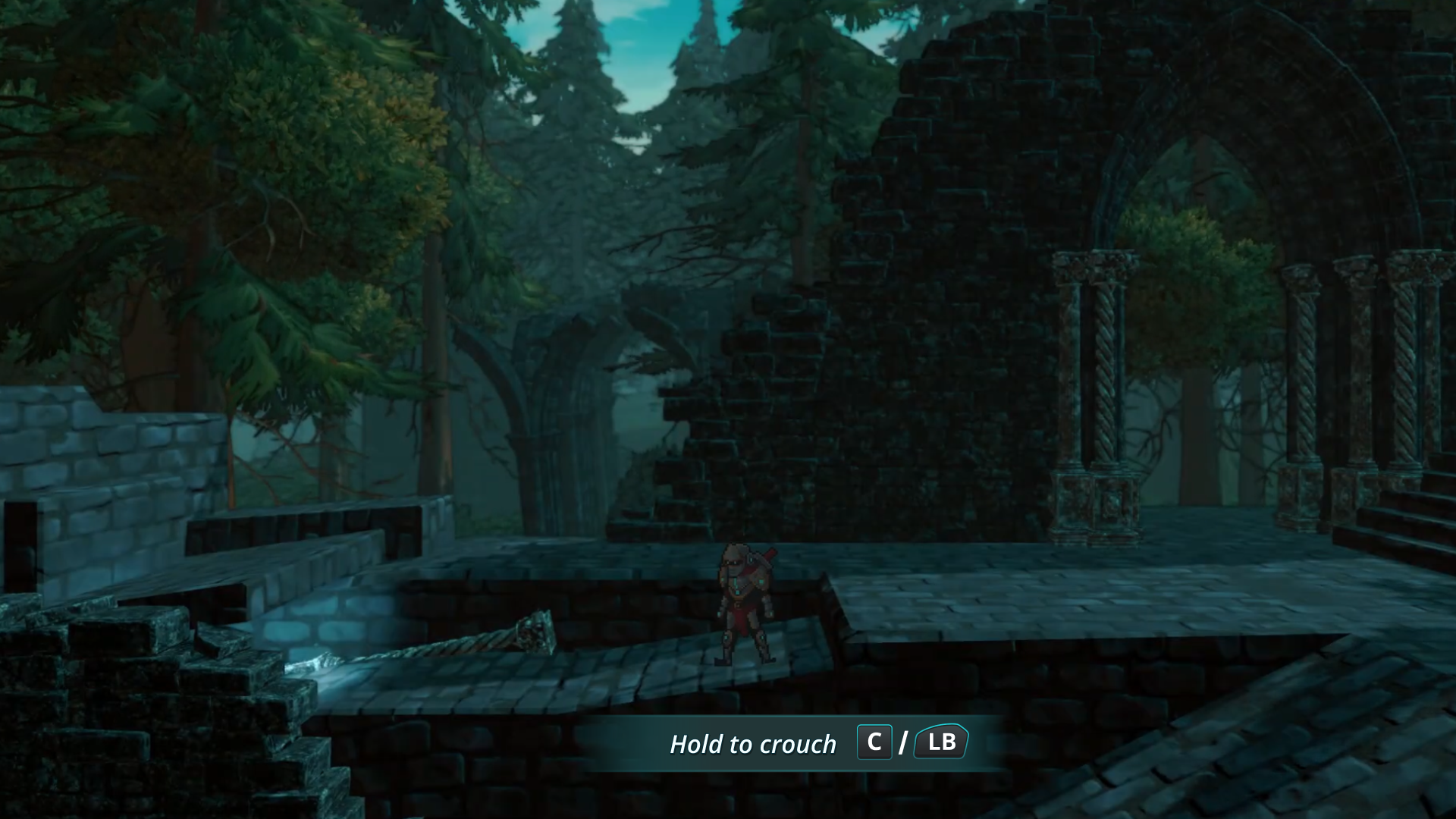
- Use persistent action prompts for recurring actions like crouching, similar to interaction prompts.
- Improve discoverability by giving intractable objects subtle visual cues such as a glow, shimmer, or highlight.
UI Elements
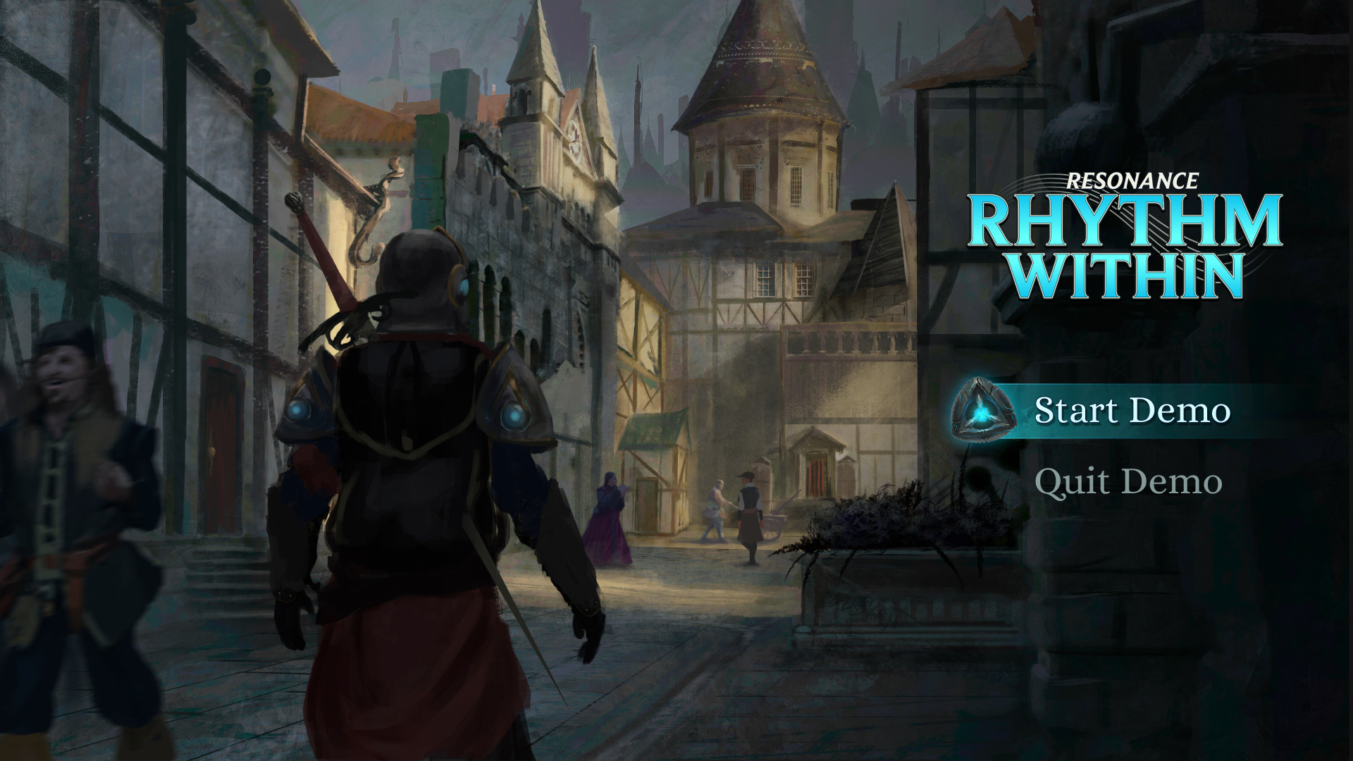
Start Screen UI
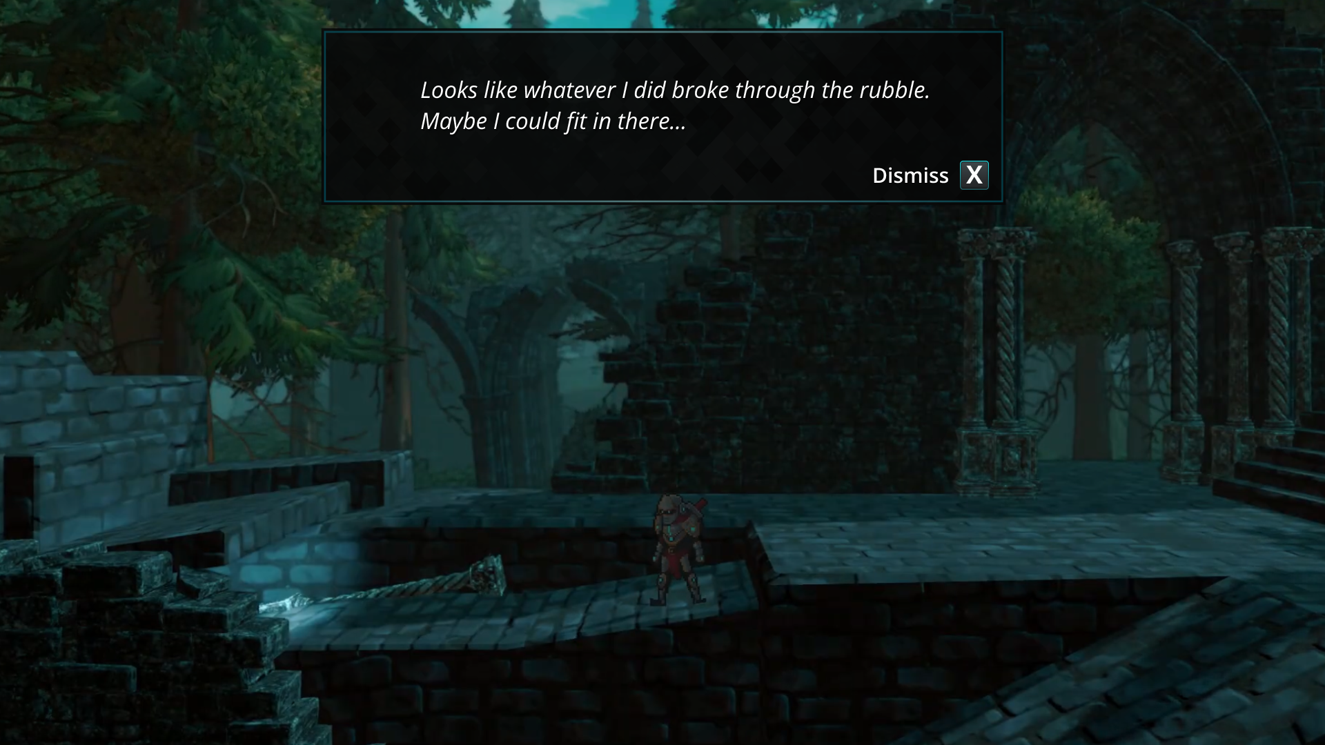
dialogue UI
Action hint UI
Tutorial UI
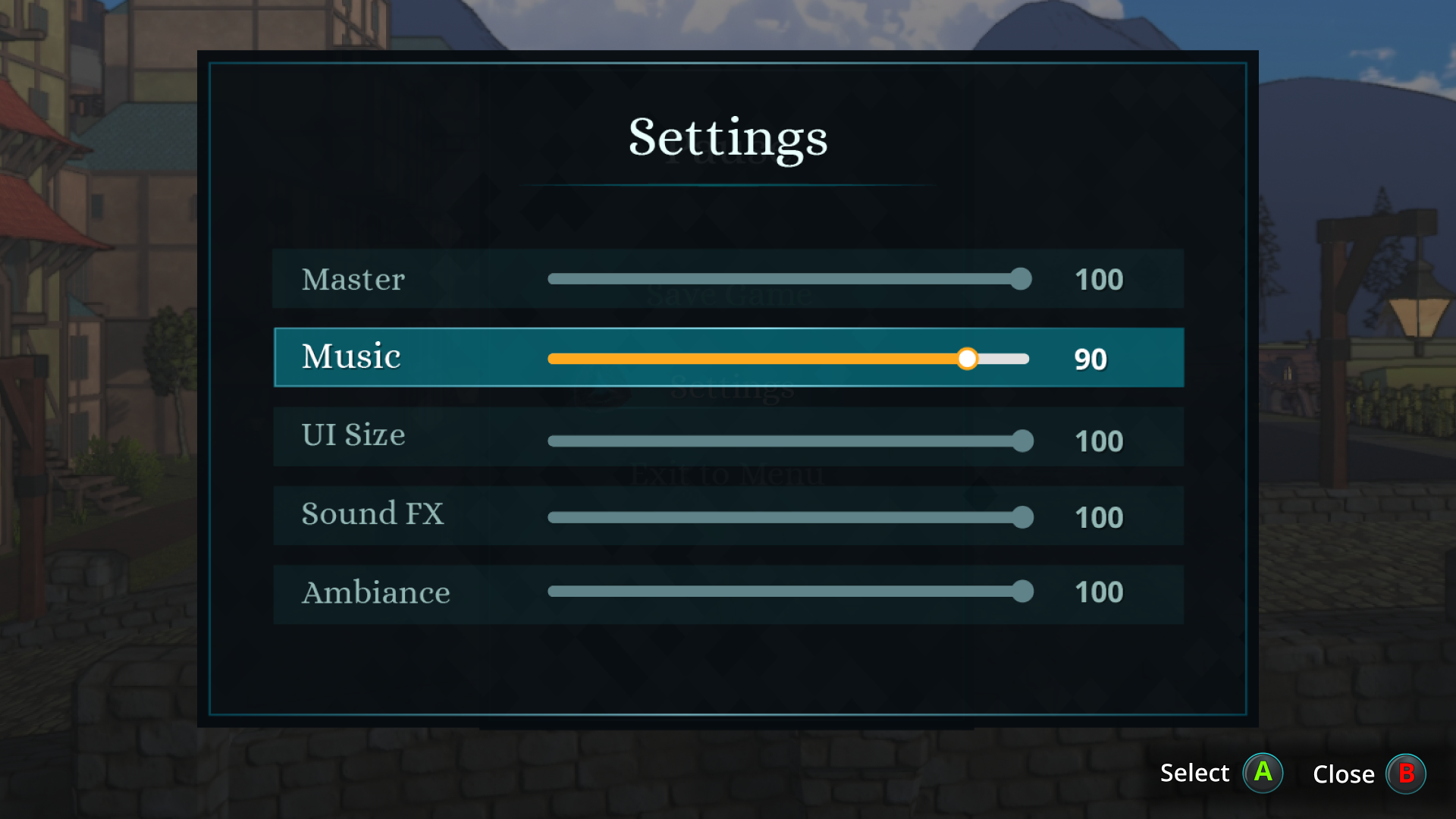
Settings menu UI
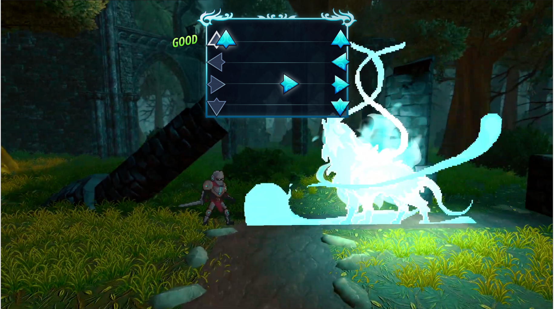
Beat Slash Gameplay UI
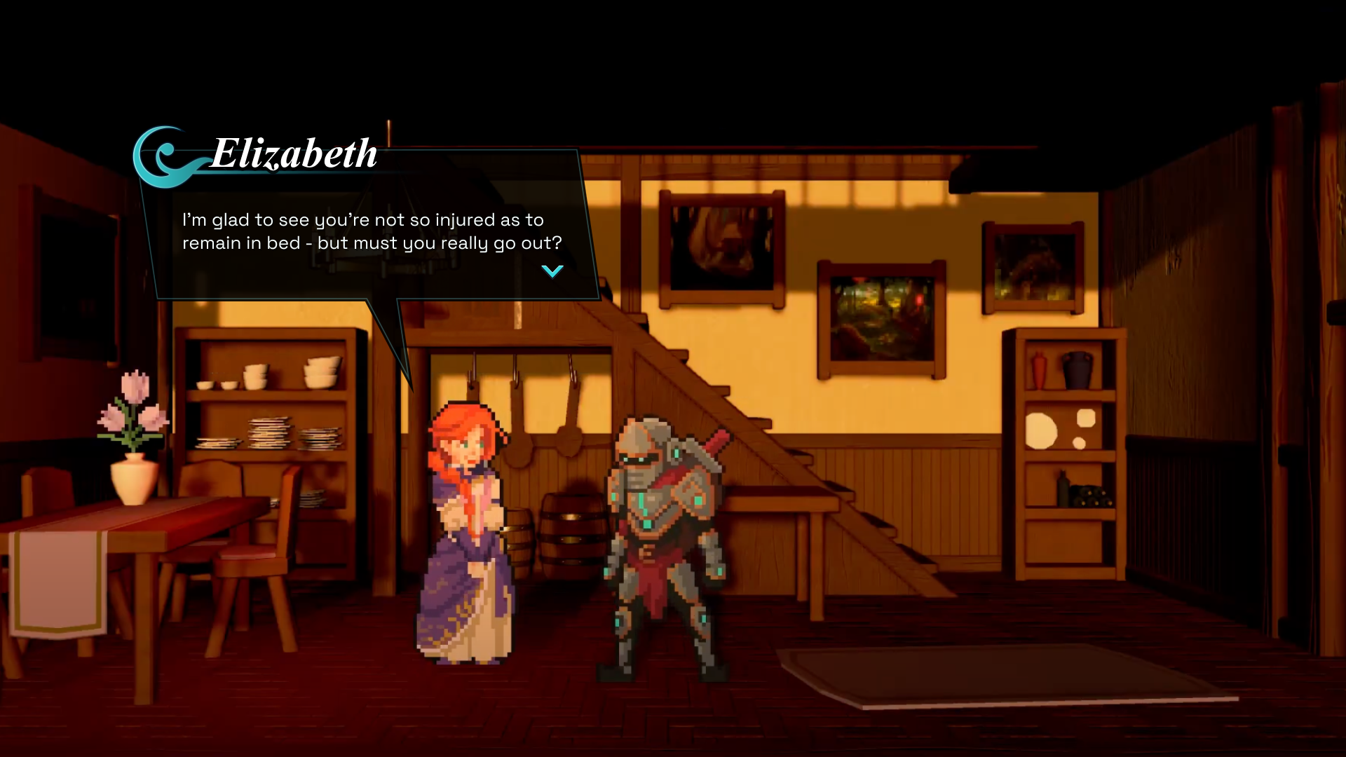
Dialogue UI
CTA UI